-
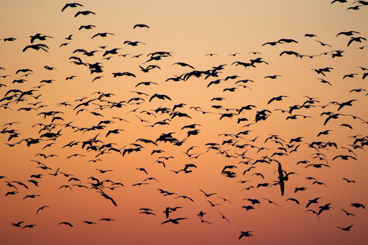
Seasonal Migration Experiment
(first written in Sep 2023, updated Sep 2025) Recently I’ve mentioned to many of you that staying in one place all year round doesn’t spark joy. So, I’ve decided to experiment with a new rhythm. For the next year, I’m going to split most of my time between three cities. If it works, going forward I will spend the fall in Hong Kong, travel...