All posts tagged: infographics

The Reliants Project in Kumu

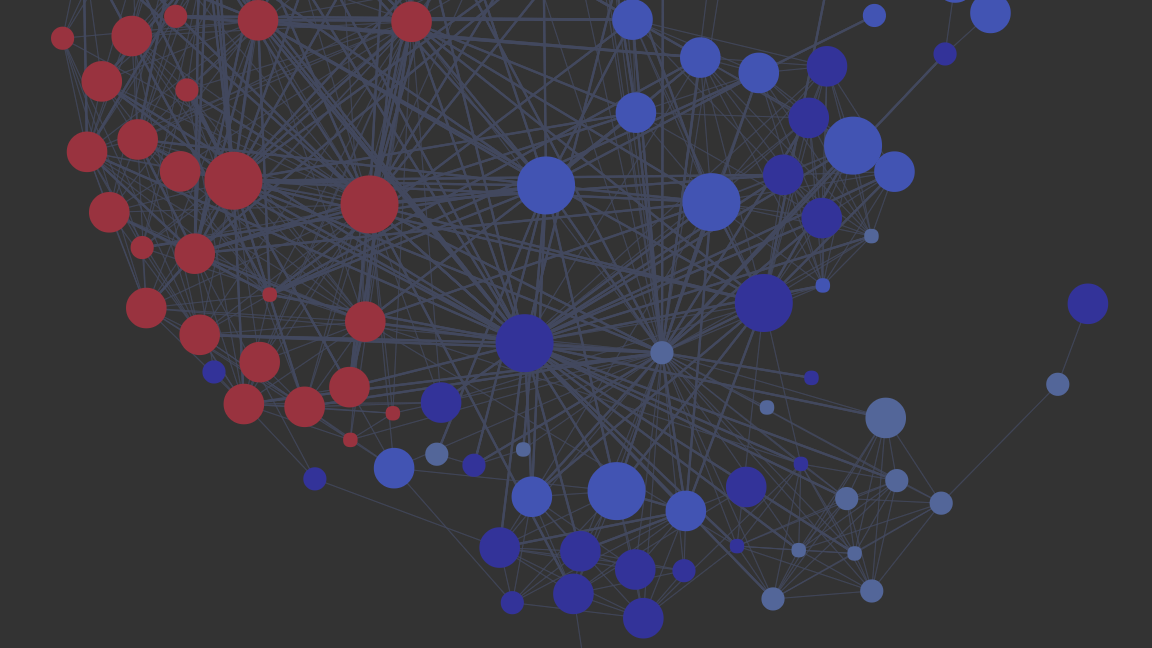
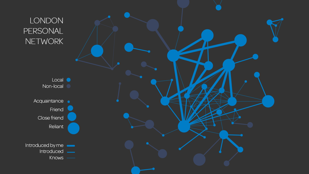
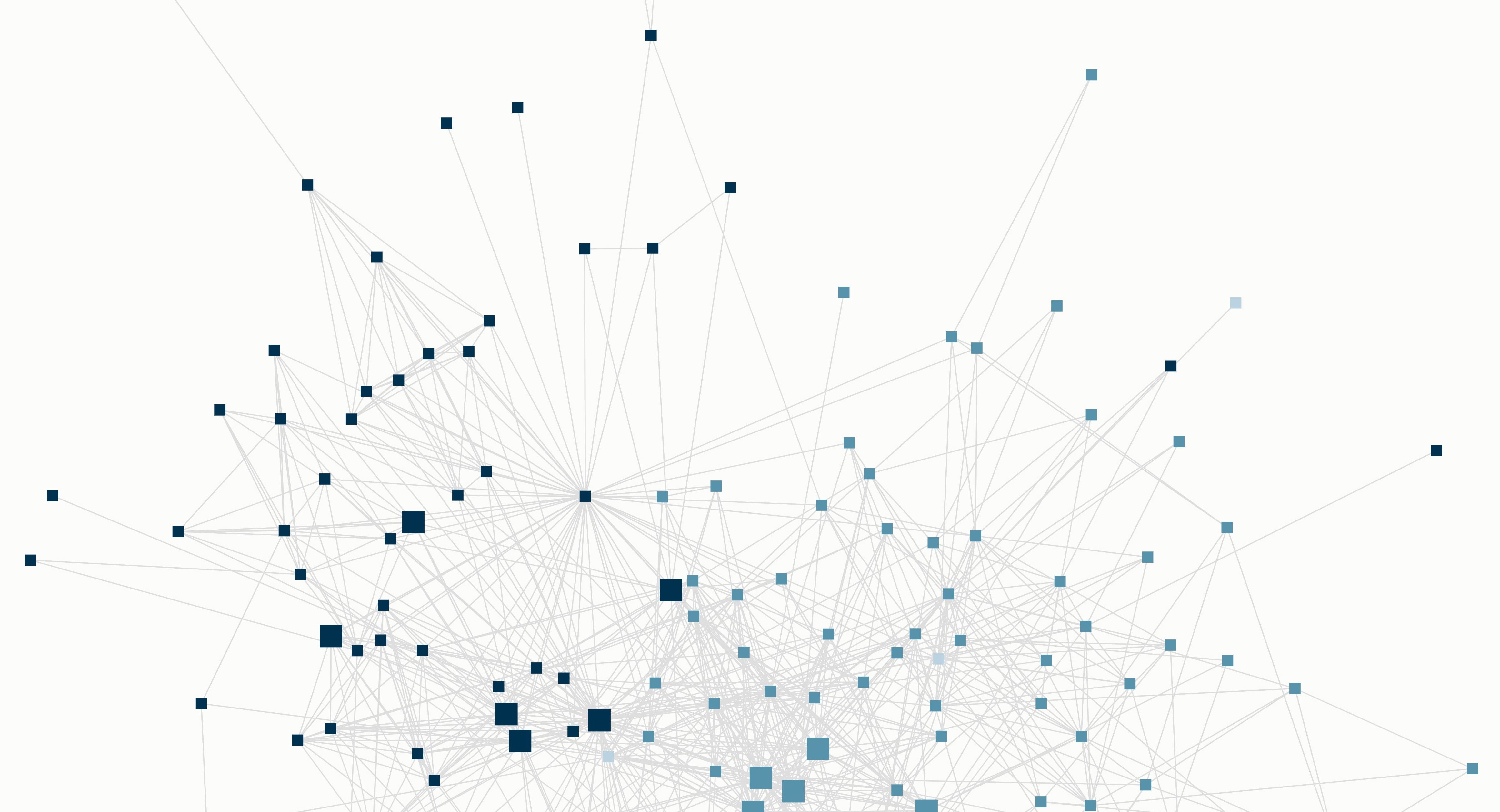
Finally, I’ve managed to embed an anonymised version of the latest Reliants Project network graph onto the front page of the site. I think it is much more interesting to engage with an interactive map than static images. Back in 2017, I shared maps showing my London personal network before and after pairing up with my partner. Before that, I shared a global map showing how my network has evolved over my adult life. Over the last year, I have introduced my partner to many people within my global network. We have also introduced many of our friends to each other. The resulting 2018 graph is more complex than the previous versions and shows a more developed London network.Reading the map. In Kumu, nodes are called elements and edges are connections. Each element represents an individual in my personal network. The connections show who knows who in that network. In this map, the colors indicate which geographical group the individual is part of (United States, Hong Kong or the United Kingdom). The large elements identify …

Primary relationships impact personal network structures

In my post “Change over time“, I hypothesised that coupling up and separating with someone would have a significant impact on the structure of an individual’s personal network. After my divorce many years ago, my network structure shifted from one that was compartmentalised to that of a ‘sampler’. Little did I know that I would soon have the opportunity to actually test this theory.Between 2015 and 2016, I tracked how my London social network grew from a small group of pre-existing connections to a reasonably strong support system. In the resulting graph, I emphasised the role that non-local contacts had in helping me expand my community. Now I’ve taken 2016 data and compared it to the present in a new visual:The most dramatic differences between the 2016 and 2017 visualisations are the new node sitting at the centre of the graph and the cluster of new nodes on the far right. That central node is my new partner and the cluster to the right is the portion of his London network that he has introduced to me. His …

Change over time

If you’ve met me, you’ve probably heard me say “change is the only constant” more than a few times. It’s been incredible to reflect on how much my personal network has evolved since university. After 12 months of The Reliants Project focused on my new London network, I decided to shift focus to 3 areas inspired by that exploratory research: Building a more complex visual of my entire personal network in the hopes that it will give me a more accurate representation of change in my network over time Visualising how new connections transition between the categories of stranger, acquaintance, friend and reliant (and even loosing touch) over time Identifying how significant life events (e.g. moving, marriage, parenthood, divorce, career shifts) impact connections’ positions within the network While I gathered data over the last 15 years, it was hard to reach back beyond 2004 (introduction of Gmail) with much accuracy. Nonetheless, this data captures 2 international moves (Massachusetts to Hong Kong in 2008, Hong Kong to London in 2015), my divorce (2010), and 4 career shifts. The first time series visual I created based on that data is below (click to enlarge).  If …

The Reliants Project: 12 months

Can hardly believe it has been over a year since I moved to London! As an anniversary present, London gifted me my first truly serendipitous connection since my arrival. Until then, every new connection was the result of either a direct introduction or meeting at an event that both people intentionally attended. It’s a rare treat to meet anyone during those in between states; by accident, in public places, on transit. I treasure those moments because they often expose a ‘small world’ coincidence or a completely new, fascinating world.Additionally, I had the chance to participate in Wait But Why’s inaugural Wait But Hi event in August. Our group was even featured in their report (scroll down about 1/5th to “Some people went to restaurants…”). They asked their readers to fill out a (long) survey and then matched them in groups based on their interests and preferences. Some people were set up on individual blind dates while others participated in large group educational seminars (and many variations between). What a fascinating experiment in friendship, relationship and community building!Round up. Here are some of the more …

Graphics tell stories

Way back when, I explained in general how I use visualisations for personal storytelling. Finally, I have a specific test case that I can share. At the end of August, a very trusting friend agreed to join me for a 95km trail run along Hadrian’s Wall path. It’s considered the best-preserved frontier of the Roman Empire and covers a beautiful stretch of land from coast to coast in North England, just south of the Scottish border. In case you’re curious, we used Contours to organise the trip and they happily took care of booking rooms, recommending daily distances and luggage transfer. I’d highly recommend them! Here’s what I did before, during and after the experience along with the resulting visual.Before: What information do you think you want to capture? What are the best / most convenient tools to capture that data?In this case, I could easily collect the quantitative data I was interested in using Strava. This app can capture distance, time, pace, elevation change among other useful metrics. As an added bonus, it will …

24 hours

Inspired by Benjamin Hardy’s recent blog post, I decided to picture my ideal day so that I can use it as a consistent, visual reminder of my priorities. A few of his probing questions caught my attention: If you repeated today every day for the next year, realistically, where would you end up? One of the best ways to consciously design your ideal life is to start with your ideal day. What does that actually look like? How often do you live your ideal day? With those ideas in mind, taking into consideration basic constraints around work, this is the current design for my ideal day:Activity type. While the activity types in the diagram don’t directly correlate to the dimensions I use in my  annual reflection, there are parallels. All of the active, reflective, and restorative habits fall within the “inward” category, while creative & productive are part of “outward”. Eating & social straddle the two categories because it’s an efficient way to achieve both within 24 hours and they’re such a natural pairing. Often I pair exercise & social time. Also, I gravitate towards collaborative …

A new year, a new tool

It seemed fitting to spend New Years in the home of an accomplished clockmaker and ironic that not a single handcrafted-clock accurately announced the arrival of 2016. What the home lacked in terms of punctuality it made up for in English country charm and wood-burning warmth. It was the perfect place to quietly reflect on an eventful 2015 and prepare for the year ahead. In the company of a very reflective friend with a well-developed set of personal development tools, I attempted to glean some wisdom and adapt his methods to fit my goals.Until now, I had only two simple processes that I employed to reflect on my year and set future priorities. For the last 6 years I’ve kept track of my happiest moments and tried to identify any patterns, trends or shifts among them. I also regularly set personal themes to guide my actions over a set period of time, which typically lasted 3 months to a year. My friend introduced me to the idea of using radar charts to rate aspects of life on an …

What remains

Visualisations can be extremely powerful. I vividly remember reading this Wait But Why post, appreciating how it cut through the noise and compelled me to evaluate priorities. When they revisited the topic a few weeks back it struck a cord, generating a lot of discussion among my network. As a result I decided to make my own version of the visual, focusing only on the time I might have left (acknowledging that each of the moments is a gift and certainly in no way guaranteed). The resulting graphic is above and highlighted stars are explained below. 2028: The year I’ll be 48, the same age my father was when he passed away 2038: The year my mother turns 90 2040: Providing I reach my 90th year, I will still have 1/3 of my life to look forward to 2058, 2061, 2066: My age will be the same as the average life expectancy of a US, UK and HK female (respectively) 2070: My 90th year Seeing the quantity of years laid out in this manner can be startling. There are an infinite number of estimates you …

Personal storytelling through visualizations

The most ubiquitous way to share personal experiences and stories is through photos. Relatively speaking, they are quick to create and can be instantaneously shared. They’re great for capturing a feeling or special moment, but rarely show change over time or the relationship between two or more ideas. Video does a much better job of displaying these nuances, which is why it has become such a popular medium for storytelling. Collages, photo books, and yearbooks were all born of the desire to provide more context to photos and document experiences. Data visualizations require more data points, a decisive angle and time to craft. However, they can capture a story more holistically, distill information into key points, help share learnings easily, and provide an opportunity for reflection. Finally, the tools to create these types of visuals are available to all and becoming much easier to use.Data visualization and the quantified self My first exposure to data visualization was through an Edward Tufte course in 1999. He is considered a pioneer in the space and his passion is contagious. These days, dynamic visual displays of data …