If you’ve met me, you’ve probably heard me say “change is the only constant” more than a few times. It’s been incredible to reflect on how much my personal network has evolved since university. After 12 months of The Reliants Project focused on my new London network, I decided to shift focus to 3 areas inspired by that exploratory research:
- Building a more complex visual of my entire personal network in the hopes that it will give me a more accurate representation of change in my network over time
- Visualising how new connections transition between the categories of stranger, acquaintance, friend and reliant (and even loosing touch) over time
- Identifying how significant life events (e.g. moving, marriage, parenthood, divorce, career shifts) impact connections’ positions within the network
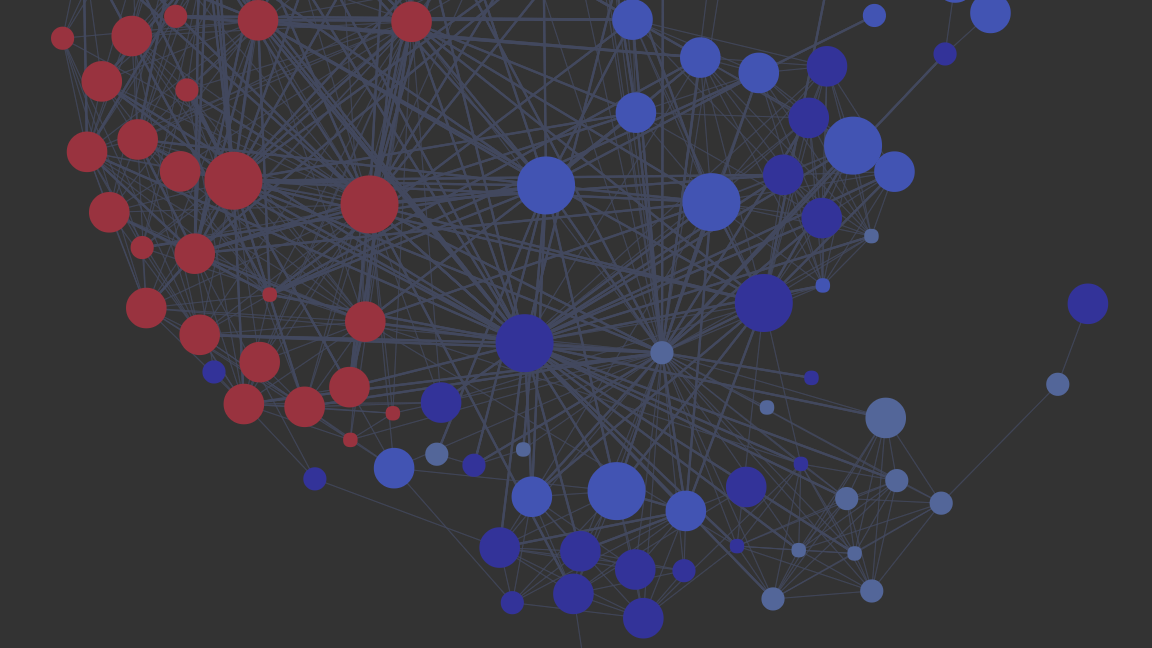
While I gathered data over the last 15 years, it was hard to reach back beyond 2004 (introduction of Gmail) with much accuracy. Nonetheless, this data captures 2 international moves (Massachusetts to Hong Kong in 2008, Hong Kong to London in 2015), my divorce (2010), and 4 career shifts. The first time series visual I created based on that data is below (click to enlarge). If you’re interested in more detail about how it was made, you’ll find it at the bottom of this post.

Emerging patterns and hypotheses. It’s still early days, but I was surprised to see how compartmentalised my social groups were during my married years. I suspect that pairing up and separating can have a significant impact on someone’s personal network structure, specially if the way they typically structure their network is different from their partner (one tight knit group vs. a diverse set of one-to-one friendships).
Immersion, by some clever folks at the MIT Media Lab, also helped me see these patterns. It visualises a network based on email metadata and can display any period of time you wish. It was interesting to see how my email graphs reflected the Polinode graphs I made with my own dataset. For example, up to 2008 I was living in Boston and had 3 main social groups outside my family (local Boston friends, designers and high school friends). They show up clearly in both the visualisations.
Basic personal network stats: 10% reliants (including family), 60% friends, 20% acquaintances (keep in mind that most acquaintances were added because they introduced me to someone who became either a friend or reliant at some point), and 10% lost touch. The proportion of reliants is in line with my London network.
How did I meet them? 45% through introductions, 30% at public events or ‘in between’ places, 10% at private events, and 15% through school or work. Half of the friends I’ve made in London are also as a result of introductions.
Survey. In order to add more richness to the data, I asked the network to complete a short survey focused on a few key aspects of their social characteristics using Typeform. They made an educated guess regarding their current social network structure (based on recently published research by Janice McCabe),where they sit within their family (an indication of their first personal network), their social type (based on the TRACOM Group Social Style Model), and any life changes that may have impacted their personal network over the last 15 years. About 60% of the network responded to the survey. Below are the actual survey questions and results.
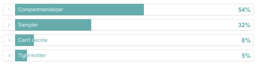
1 | Based on your current friendships, would you describe yourself as a ‘Tight-knitter’, ‘Compartmentalizer’ or a ‘Sampler’?
Tight-knitter: You have one dense group of friends in which nearly everybody knows one another.
Compartmentalizer: You have two to four “clusters” of friends who don’t know each other; one “cluster” may comprise people you have fun with, while another could be made up of people whom you turn to for work-related support or advice.
Sampler: You have one-on-one friendships, rather than groups of friends, and don’t rely on friendships for a sense of belonging.
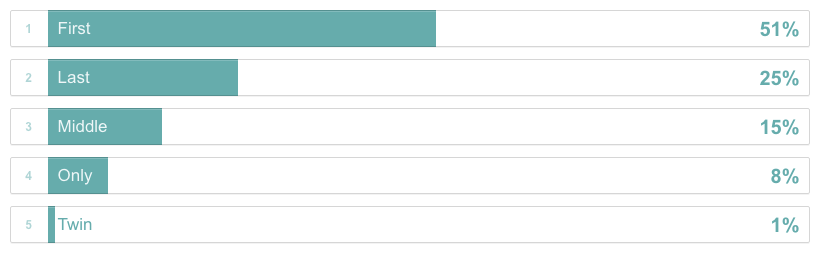
2 | Within your family, which child are you?
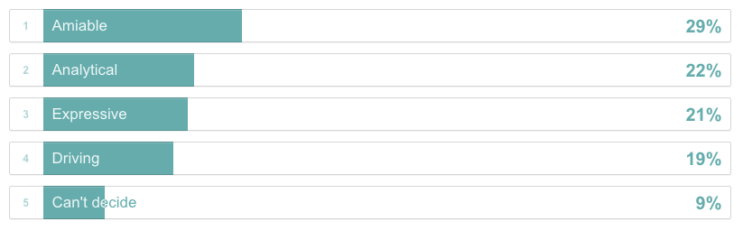
3 | Any guess what your Social Style Model type is?
Analytical: control their emotions but tend to ask questions rather than tell people what to do. They are focused on accuracy, and they act deliberately to achieve that end. Others see them as slow-paced and detail-oriented.
Amiable: show their emotions openly and prefer to ask questions rather than tell others what to do. Relationships, feelings and personal security are important to Amiable Style people. Others see them as friendly and warm.
Expressive: show their emotions and speak assertively. They enjoy sharing their ideas and perspectives openly with others. Others see them as creative, but unfocused.
Driving: control their emotions and speak assertively. They prefer to control a situation and are focused on the big-picture. They are often seen by others as highly efficient and not concerned about relationships or feelings.
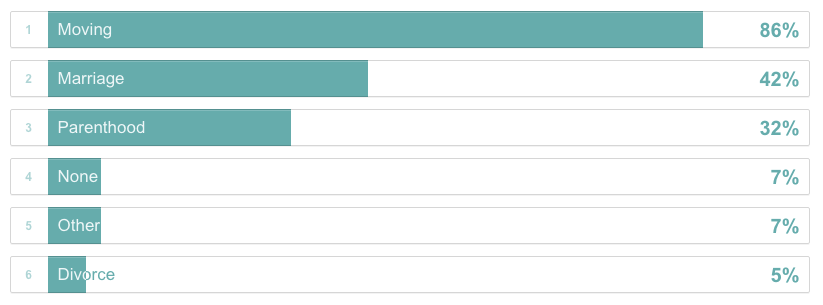
4 | Based on academic research, experiences of moving, marriage, parenthood and divorce typically have the most impact on individual’s personal network. Have you experienced any of these significant life changes in the last 15 years?
5 | Out of curiosity, is there anyone that I’ve introduced you to that has become a friend, close friend or reliant? If so, who? Just to clarify, for the purpose of this research I categorise friends like this:
Friends: would invite to a group dinner
Close friends: would hang out 1-on-1
Reliants: would ask to help move flats
Out of the group I surveyed, 30% mentioned at least 1 friend, close friend or reliant that I had introduced them to. Certainly makes you feel warm and fuzzy!
Initial survey analysis. My reliants are significantly less likely to have the same social style as I do (5% vs. the survey average of 21%). Also, my reliants are more likely to be first born children (63% vs. the survey average of 51%). Unsurprisingly, there are no ‘tight-knitters’ among my reliants and few among the survey participants.
Simplifications. As you can see from the survey, my friends move a lot. At this point, I don’t acknowledge most of those moves in the visualisation. I also didn’t attempt to visualise when other people met each other or I introduced them. Finally, I only included a fraction of my acquaintances in order to keep the data set manageable.
The how. There is currently no easy way to do this, but there are a few tools that make it less tedious. Polinode offers an Excel template (1 file with 2 sheets – 1 for nodes and 1 for edges) that will give you a sense of what file you need to create for their software to visualise it.
- Start with an existing friends list. In my case, I send quarterly email updates to my personal network, which was a reasonable starting point. Facebook and LinkedIn are likely to be frustrating unless you keep your connections well pruned.
- Build a sheet of ‘nodes’ (friends) with at least these basic columns: real name, name, and friend category. I also included email address, gender, nationality, location, how we met, friend categories in time intervals and survey responses. The ‘name’ column is important if you want the real names to remain anonymous. I filled that column in with numbers.
- Build a second sheet for ‘edges’ (connections), which is a matrix of who in your network knows each other. Copy the real names and names to this sheet in both the first column and row. You can use a formula to reflect the content from one half of the matrix to the other. Filled out, the matrix it will look something like this:
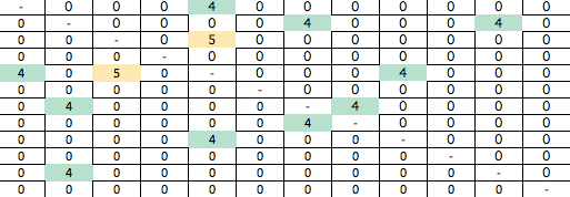
- For the node friend categories, I used lost touch, stranger, acquaintance, friend and reliant. I gave them each a value: -1, 0, 1, 2, 3. For the edge categories, I used stranger, known, and introduced. I gave them each a value: 0, 4, 5.
- In order to gather the data, I looked at social media and communication tools like email, Skype, WhatsApp and instant messenger programs. Immersion was also really helpful for this.
- Once you’ve filled in the sheets, you can save a version of the Excel file without the real names and any other sensitive information.
- Next, you can convert the edge matrix to a 3-column table using the ‘reverse pivot’ feature in Excel. There’s a nice step-by-step explanation on Stack Overflow. You can delete the rows that are irrelevant if you like (where the value is either – or 0).
- Use Polinode to visualise the network by uploading the anonymised Excel file and selecting ‘No’ to the Advanced Options question about whether the edges are directed (unless you’ve structured your data that way). Once your network has been created, you can play with the parameters to visualise various attributes of the nodes and edges. They have a whole host of tutorials on YouTube.
- In this case I created 5 network views, each looking at a particular time slice. Then I exported the pngs and combined them into one image.
Don’t let the short list fool you. Each step takes a lot of effort, but the results are rewarding. Happy to field any questions from people who want to give it a try! As for me, there’s a ton of information to pour over and I’m still learning how to interact with it. Would love to hear any questions you think I should ask the data!
Pingback: Celebrating friendships | with ease
Pingback: Primary relationships impact personal network structures | with ease