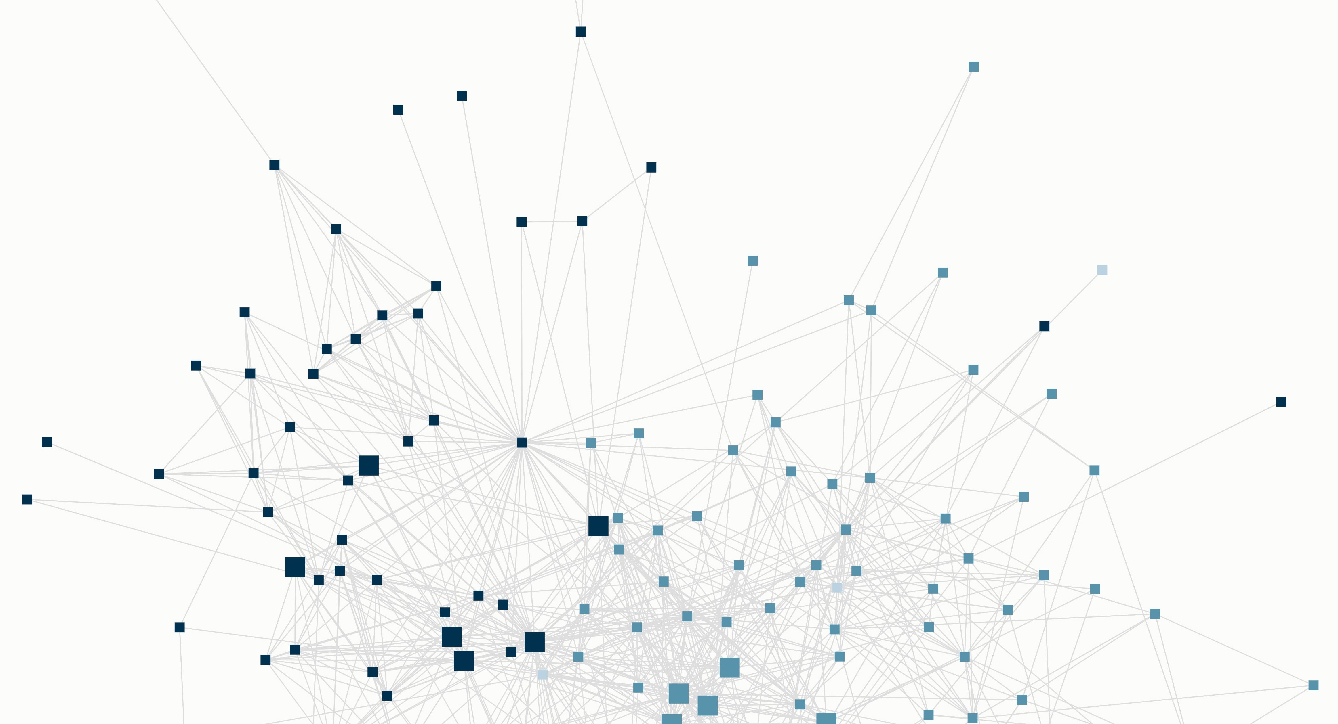
Finally, I’ve managed to embed an anonymised version of the latest Reliants Project network graph onto the front page of the site. I think it is much more interesting to engage with an interactive map than static images. Back in 2017, I shared maps showing my London personal network before and after pairing up with my partner. Before that, I shared a global map showing how my network has evolved over my adult life. Over the last year, I have introduced my partner to many people within my global network. We have also introduced many of our friends to each other. The resulting 2018 graph is more complex than the previous versions and shows a more developed London network.
Reading the map. In Kumu, nodes are called elements and edges are connections. Each element represents an individual in my personal network. The connections show who knows who in that network. In this map, the colors indicate which geographical group the individual is part of (United States, Hong Kong or the United Kingdom). The large elements identify the ‘reliants’ (close friends and family that I rely on) in my network, which happen to be evenly distributed across the 3 geographies. There are a handful of characteristics that describe each element, including a ‘tag’ that indicates the context in which we met (public event, school, work, introduced, etc). For now, I’ll focus on a few of the key features that I’ve been playing with:
- Focus feature
- Community Detection
- Highlighting elements and connections
- Filtering elements and connections
- Social Network Analysis
Focus feature. One of the ways you can interact with this embedded map is using the focus feature. You can select an element on the map and then click the sight icon on the right-hand-side of the window, below the zoom icons. This makes the selected element the focus and displays all the direct connections of this individual. You can then select the up arrow to expand the focus to indirect connections. This gives you a sense of how many degrees of separation there are between different elements based on where they sit on the map.
Community detection. You may be able to see clusters of elements within the map. These are referred to as communities in Kumu and represent groups of individuals who know each other. They might be work colleagues or friends from the same school. In some cases they are easy to identify visually, but Kumu also has a tool that helps you to identify them mathematically. It was able to identify 7 distinct communities within this map which turned out to accurately reflect how I would categorise my friend groups.
Highlighting and filtering. The giphy below runs through the different views of my network map, which take advantage of the highlighting and filtering functionality: 1. Default view of the whole network, 2. Highlighting my HK network, 3. Highlighting my US network, 4. Highlighting my UK network, 5. View with elements ‘pinned’ and introductions I’ve made filtered out.
Social Network Analysis. Kumu also allows you to generate a handful of metrics. Unsurprisingly, the individuals that rank high on most metrics are also reliants. This accurately reflects my behaviour, since I make an effort to introduce my family, partner and close friends to my network. Of course, the metrics are only as good as the data. Since I built this data set by hand and may be missing some connections, the results are likely to be imperfect. Also, it’s a reflection of the network from my point of view and doesn’t consider the strength of connections between these elements.
That’s all for now! I’m working on a handful of different graphs and look forward to sharing them on the blog soon. As usual, I welcome any feedback or suggestions!